toggle

Actionable insights, vividly visualized

Change the way your teams consume data. Upgrade to modern BI with interactive visualizations and make faster decisions. Be a modern team that thrives on data with our data visualization services.

image

Our Data Visualization Services

Stay on top of everything you want to act

UX-driven data visualization

UX-driven data visualization

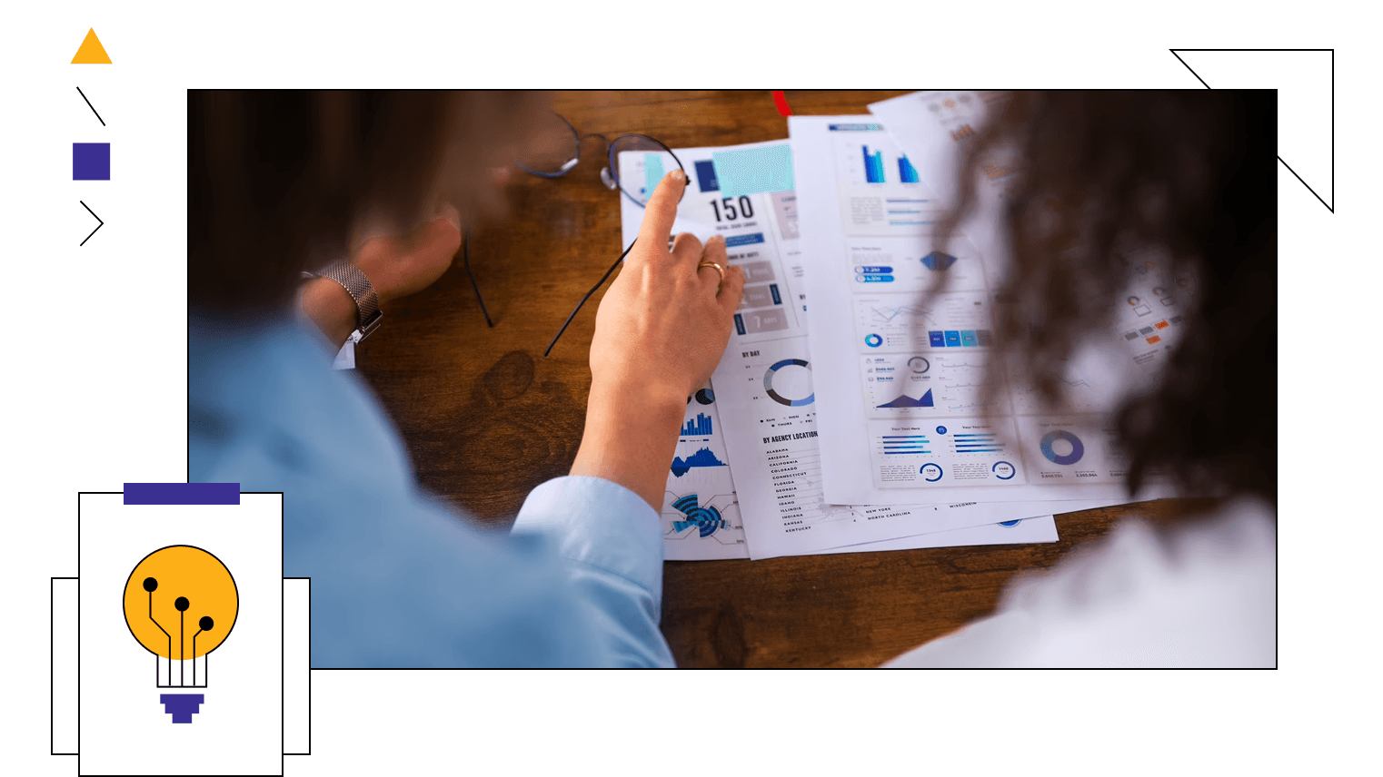
Where data narrative meets design thinking to create clutter-free interfaces. Your team deserves functional dashboards that offer meaningful insights. Insights that are accessible and that you actually need - all in the form of human-centric stories.
We take care of this aspect and choose the right visual elements. Things that are easy on the eyes, explanatory, and accessible, illustrating every KPI you want.
Metrics that matter

Metrics that matter

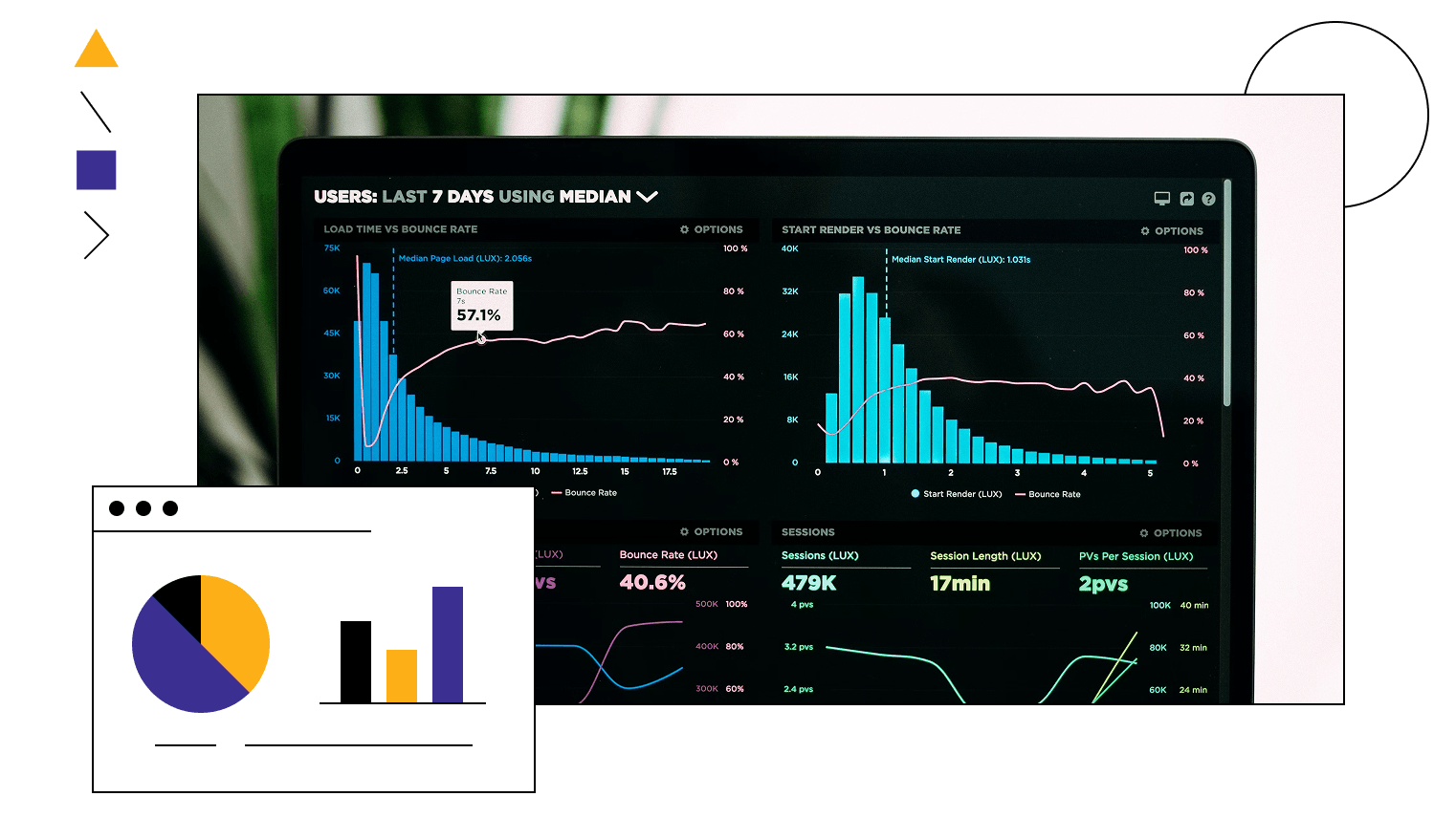
Chase metrics that matter. De-weed unwanted insights and see what you need to. Our 3-step process to effectuate this—understand your business goals, narrow down metrics that matter, and turn them into graphical excellence. Thus, your visualization reflects hyper-focused insights that you never knew you could derive from your data.
Become truly data-driven with us by gauging the right metrics that are in line with your business goals.
Data-driven storytelling

Data-driven storytelling

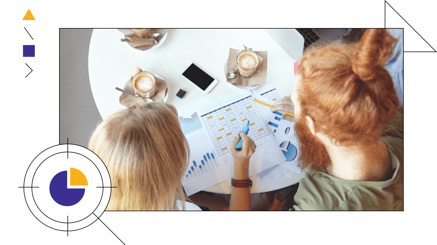
The major goal of data visualization is to improve time-to-insights. For that to happen, dashboards must convey a data narrative through your stats. Humanized outcome & maximized impact. One of our data storytelling examples comes from tracking manufacturing downtime. Imagine a dashboard that voices the story of machines, not just listing the numbers.
Everyone—from technicians to executives—gets to see the big picture without getting into much decoding. We have our approach for this - weave stories around numbers and create dashboards that tell stories.
Modernized data visualization strategies

Modernized data visualization strategies

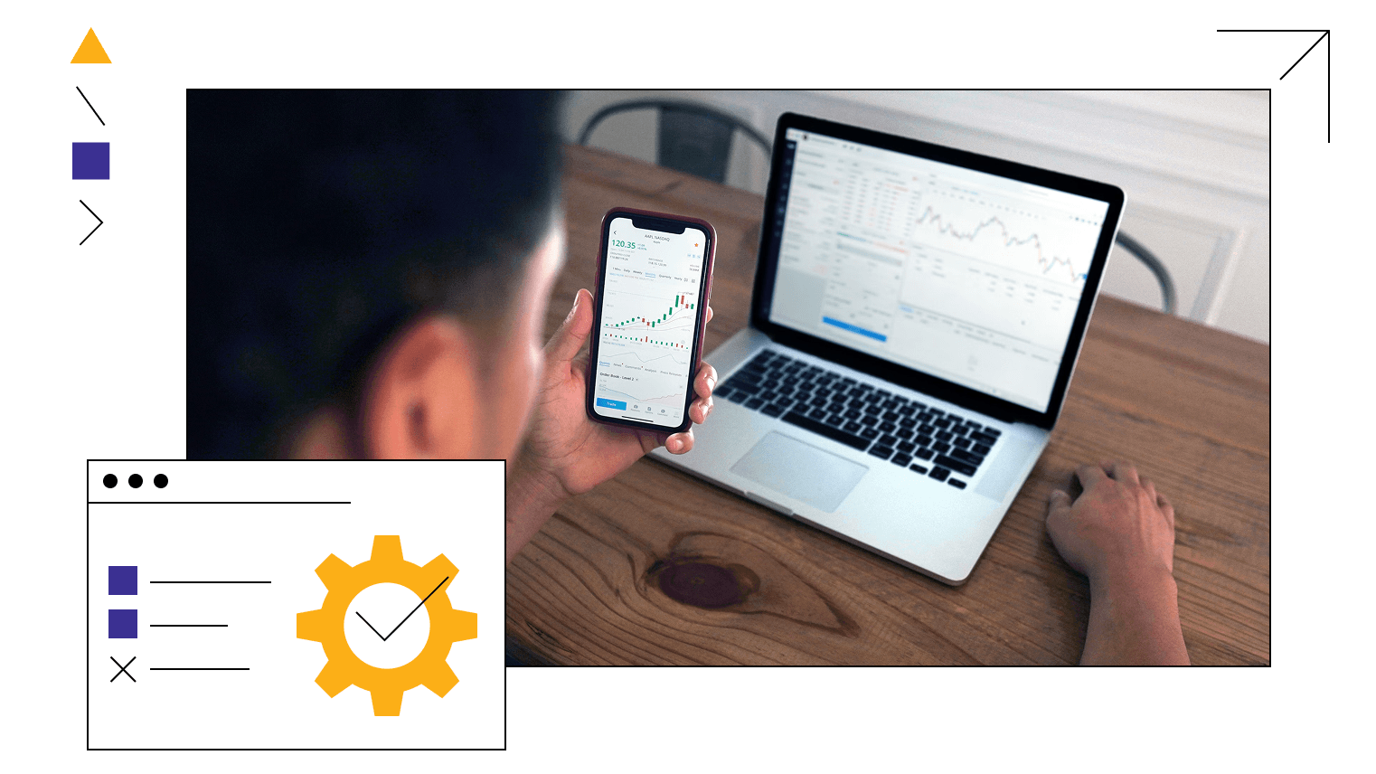
What do modern businesses expect from data visualization? Self-service analytics that serves up-to-date insights to the right person—whenever needed. Enter modern data visualization—visually pleasing, orchestrated with scalable properties, and draw data from disparate sources for multifaceted insights.
Our core principles lie around these modern strategies. Results? Highly visualized dashboards with clever insights for faster collaboration among teams and easier interpretation. Give your analytics an out-and-out overhaul and enable a seamless transition from boring to brilliant visualizations.
Tailored embedded solutions

Tailored embedded solutions

Level up your decision-making with embedded dashboards. Get custom dashboards built and embedded into other applications to drill down into the data.
This way, you can see insights and act on them - all within the same place. That too, with visualizations, user experience, and functionalities optimized for seamless integration and performance. 

Decision making simplified with data

14-days no-commitment POC. Schedule a call to initiate yours.

Consultation

OUR PROCESS

Iterative cycles to go from good to great dashboards

Discover

Design

Develop

Debug

Deliver

Discover

We start the process with a discovery call to define the scope and understand your bottlenecks and major concerns. Then, we build an effective roadmap, tailor-made as per your needs.

Discover

Design

We uncover the KPIs that your charts must speak out and sketch a low-fidelity layout with the right visualizations - following the best practices.

Design

Develop

We prepare the data and develop the visualization system. Iterative development is in our DNA. So, we keep fine-tuning the outcome until it meets its specific goals - visualizing actionable insights.

Develop

Debug

We check how precise the visualization outcome is for the sample data. If any deflections noticed, we trace it back to its root, fix, and repeat until the system works fine.

Debug

Deliver

This is the end stage where you will get access to the dashboards. We will make sure that the right people have access to the right insights.

Deliver

Discover

arrow

Design

arrow

Develop

arrow

Debug

arrow

Deliver

arrow

BENEFITS

Churning out bite-sized insights

1

Reveals trends and hidden patterns

Every dashboard is a treasure that can unleash many powerful, potential possibilities. The ones you can’t otherwise derive from muddy data sources.

2

Better insights

Visualization highlights what’s necessary for you to get the big picture and granular details, filtering the noise. So, every stakeholder can quickly get on the page just by looking at the dashboard.

3

What, why, and when happened?

Dashboards are more than historical representations of data. See what happened and when, understand why it happened, and predict what can happen - just connect the dots.

4

Fast & accurate decisions

The kaleidoscopic view of data is what you need to accelerate your time to market. You can understand inter-lying connections, make out patterns, bridge information, and see where they all lead.

5

Visually engaging

Immerse yourself in intuitive, interactive, and multifaceted dashboards with customized fields - that even a layman can grasp.

CUSTOMER SPOTLIGHT

Success stories from businesses like you

Microsoft Fabric reduces 50% cloud expenses and makes near-real-time reporting possible

From Power BI to Microsoft Fabric: How Tire Distributors Met All Their Data Needs Without Spending a Penny More.

Automated & accelerated data reporting with Microsoft Fabric

Pharma company brought down the report availability from 1 day to less than 15 minutes with Microsoft Fabric.

Load more

CLIENT VOICES

Take our customers word for it

I just wanted to say a big thank you for all the support you've given us. Your expertise in Data and Analytics is really helping us make better data-driven decisions. The way you're assisting us with MS Fabric is fantastic, and we're excited about gradually migrating to it to boost collaboration across our organization.

fisayo

Fisayo Oduyemi

IT Business Analyst, Saluda Medical

The team at datakulture are inspiring to work with. Their drive for excellence and the values they share from the top down are impressive. The result is top quality work and a partner you are proud to work with.

liran.png

Liran Lahav

COO, Q Report

We were really impressed with their service orientation and understanding of our business. Showcasing expertise in data engineering, datakulture was successful in implementing the dashboard, allowing the client to track their KPIs and make data-driven decisions. The team's solid understanding of the client's business and their needs was critical to the project's success.

biswajit-rath

Biswajit Rath

Head of Analytics, Raymond Limited.

They were flexible and adaptive to the client's changing requirements. The team executed a smooth workflow to ensure the project's success. Their flexibility and adaptiveness were notable in the partnership.

bhargav-raghavendra

Bhargav Raghavendra

Senior IT Director, Cyient

Our partners

microsoft
tableau
aws

FAQs

Got questions? We got you covered.

How can visual analytics benefit my business?

arrow

Can visual analytics solutions be tailored to meet specific industry or business requirements?

arrow

How do I initiate engagement with your visual analytics services?

arrow

What sets your visual analytics services apart from the competition?

arrow

What are the tools and technologies that you use to create BI dashboards?

arrow

All the metrics you need in one place

Talk to our experts today and visualize your data like never before.